Sketchbook
Photoshop Designs
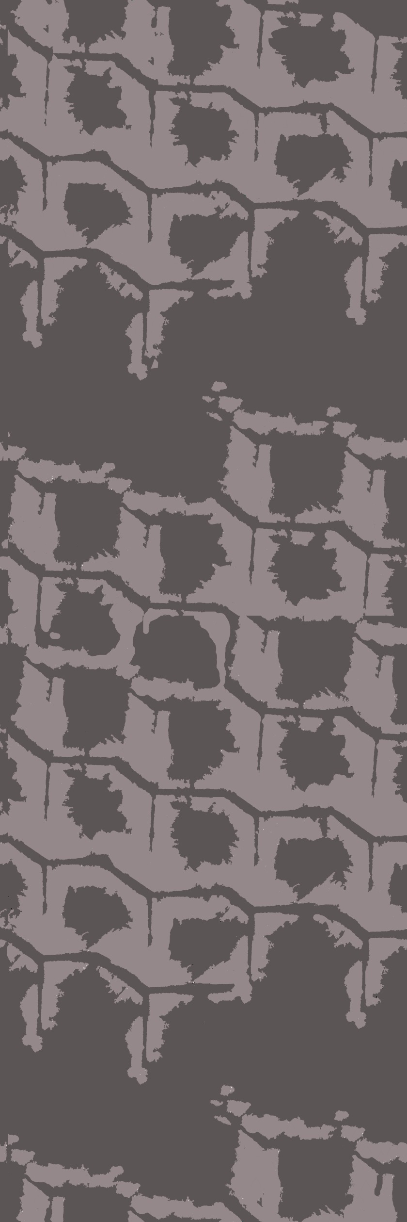
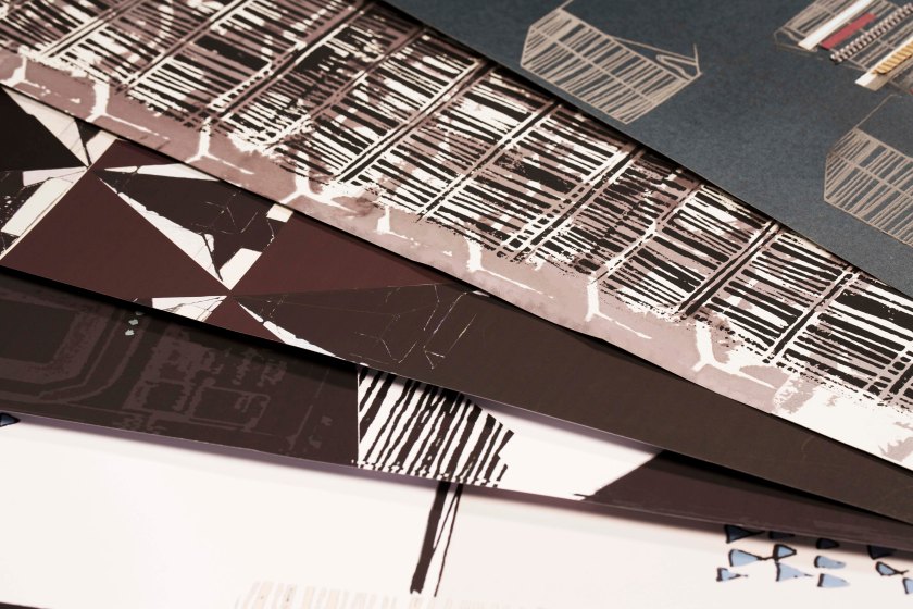
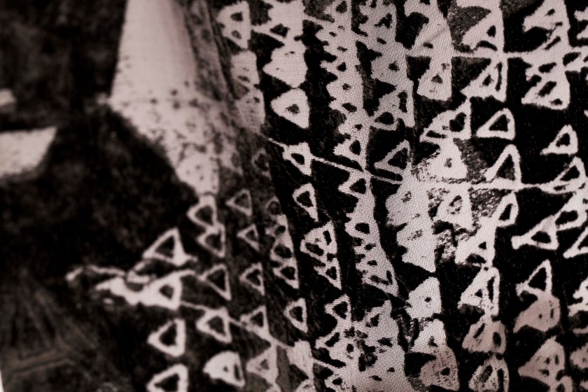
Fashion, TextilesHello, for the outcome of my current project, I have to create a repeat pattern for a fashion context. I have been experimenting with Adobe Photoshop Elements in order to create a repeat so here are some of my outcomes!
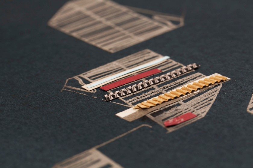
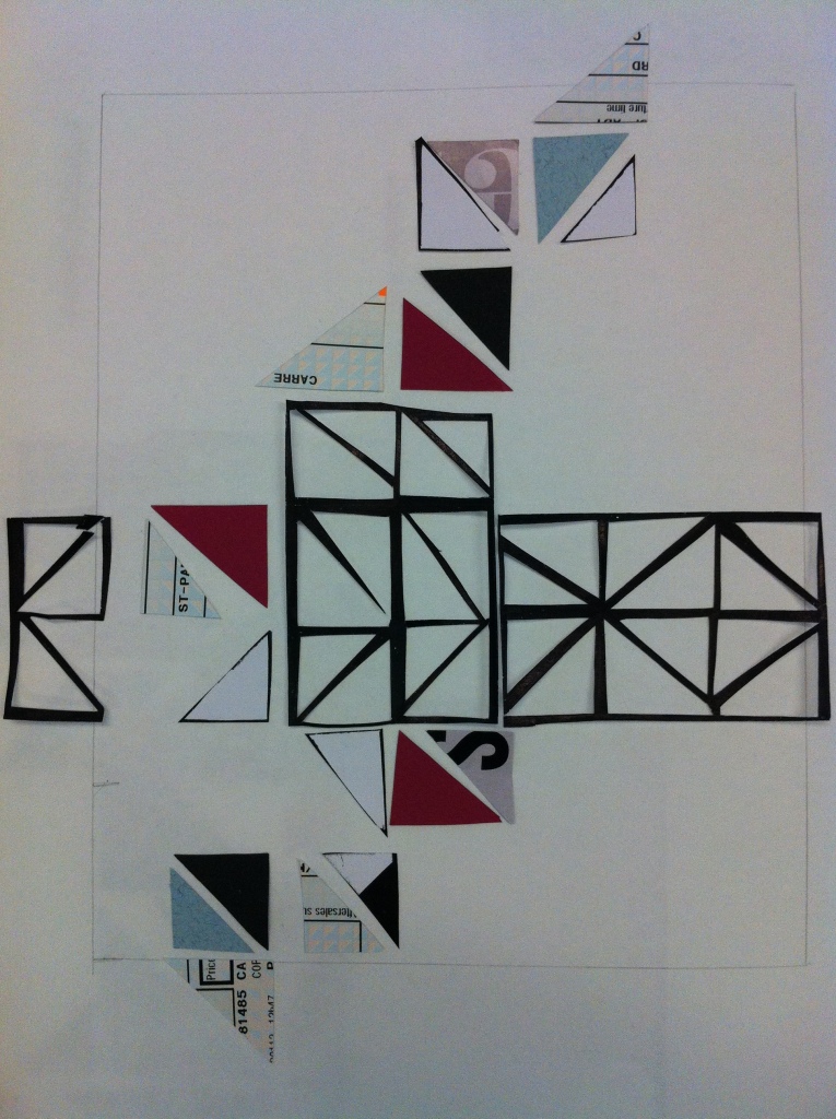
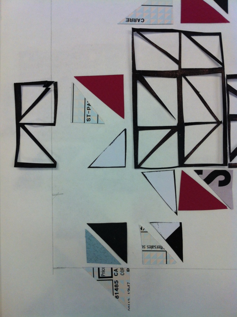
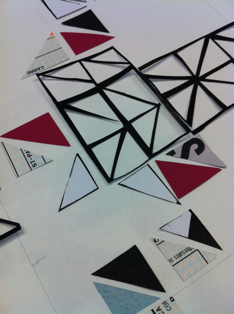
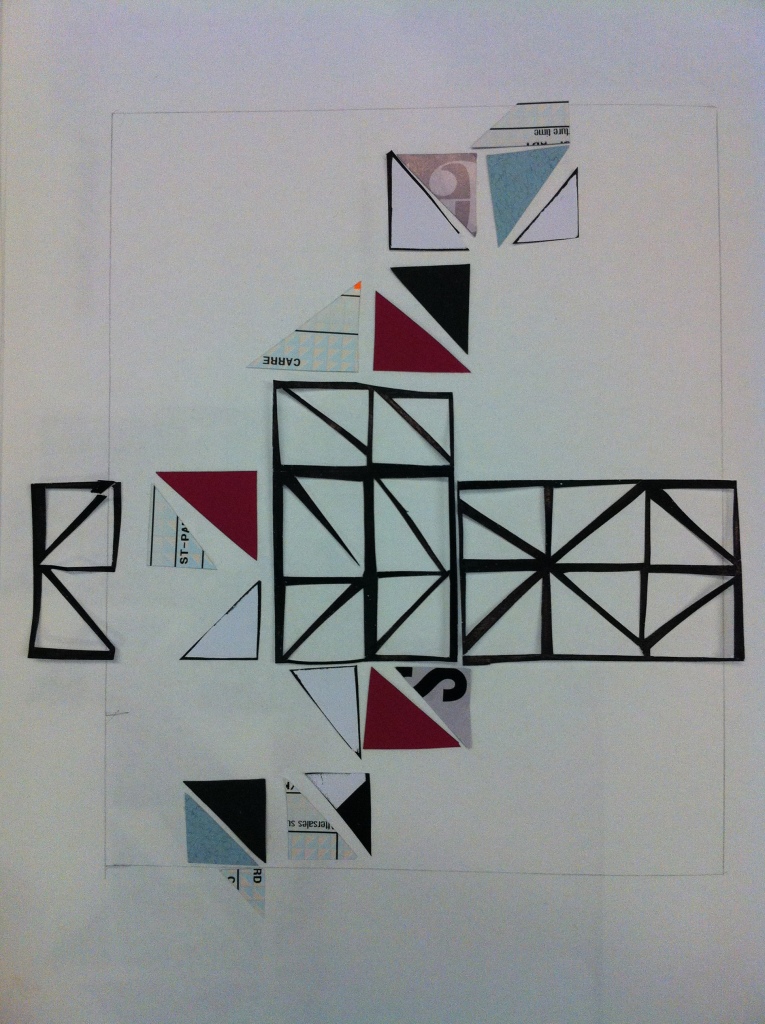
This photograph is a section of the repeat that I have used. This sample has been created by hand cut paper, card and recycled scrap paper.
Digital Samples
Inspiration:Bradford Project
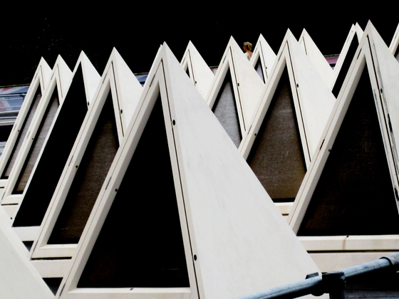
Love, Sketchbook Work, Sketching/Drawing, TextilesI recently found a photograph on PATTERNITY that I really love! It’s simple but very effective and I think it gives a lot of information for design. This photograph is from a piece of architecture (I think from the roof of a building).
- Natalie Sharp
I was really inspired from this photograph because I feel it suits my project extremley well and represents the geometric graphic print that I want to achieve in my final outcomes! Here are some sketches from sketchbook.
I used a selection of different papers for collage (recycled, heavy weight, light weight, newsprint etc) I really like this colour palette because it’s quite graphic but doesn’t have too many vibrant colours that would perhaps make it too intense. The next series of photographs are collage pieces that I was experimenting with today so that I could start to create my final outcomes. My main factors for these pieces were:
- Placement
- Colour
- Geometrical Shapes
- Repeat Design
As my brief is based for a fashion context, repeat pattern is very important and I feel the best key to an eye-catching graphic fashion print!
Rate me! or let me know what you think!
Project work so far!
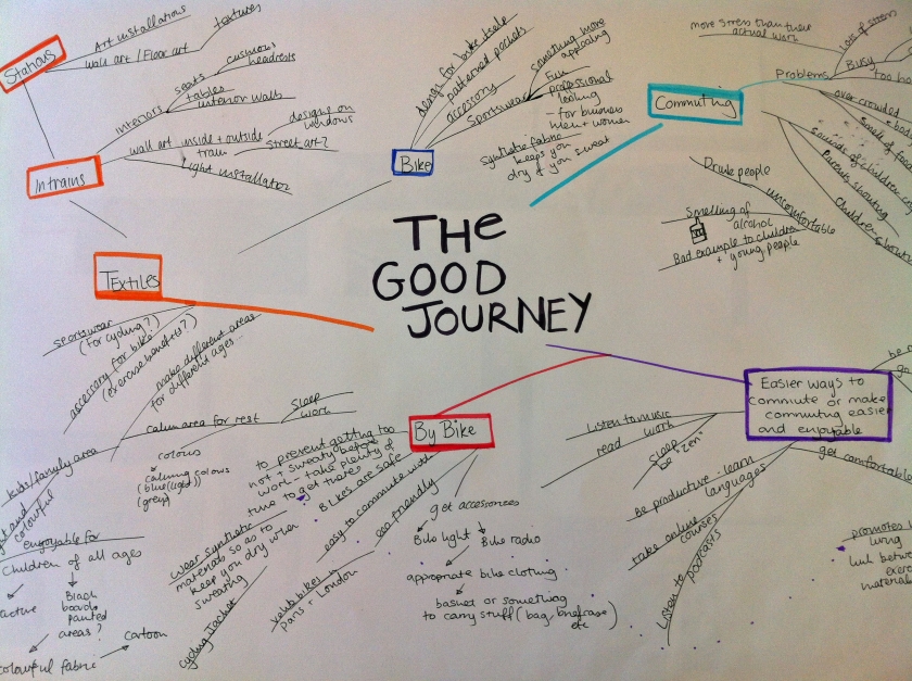
Photography, Sketchbook Work, TextilesHello! so recently, I have been doing a lot of research for my latest project in uni. This semester, I am focusing on the RSA brief “The Good Journey”. This brief asks us simply to improve our daily commute and make it more enjoyable. This brief relates very well to me because I am a regular commuter (I commute from Glasgow to Dundee every weekend) and I know some of the commuting problems that happen whilst on trains. My aim is to create an interesting environment for families on trains using interesting and tactile print designs and create interesting textured and sensory surface designs.
Here is some photographs showing my progress so far!
Mind map for inspiration!
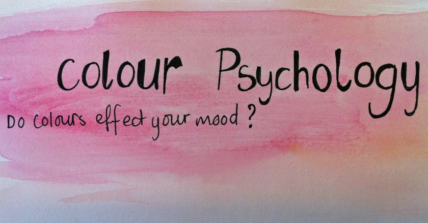
These images show some of my research and as you may have guessed, I have been looking into children’s games and puzzles for my inspiration!
This is my handmade dolls house made by my grandad 🙂 I loved it! …still do even though it currently lives in my loft! since I wanted to take inspiration from children’s toys, I thought this little dolls house would be a nice object to take inspiration from.
I tried to create a textured surface that is similar to the texture on the doll’s house exterior. I also found a rocking horse, a little wooden puppet and many other little toy treasures in my loft so hopefully they will provide me my inspiration for this project!
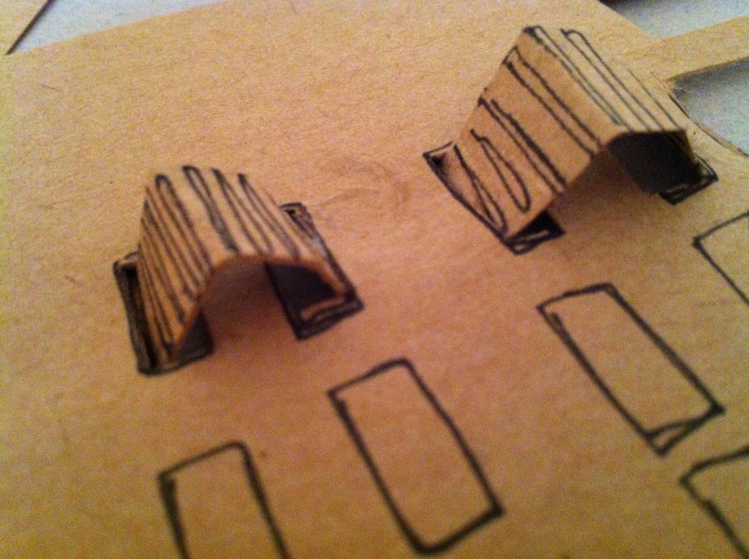
As I am looking into creating interesting surface design and create interesting tactile prints, I have been experimenting with paper to create interesting 3D pattern.
That’s my progress at the moment so there will be a lot more to come over the next couple of weeks!
Project so far…
Love, Photographyhey, not posted in a while so… my bad!
Over the summer, I had been set a project for University which was to draw a source or sources of my choosing so that it will allow me to find my “drawing style” and to develop drawing skills. I know my style already so as I love drawing, this project is great for me! I had struggled to actually start it though because I couldn’t decide what to draw or what theme I would like… A few weeks ago, I went to London with my family for a few days and it was there that I found my inspiration! London was great (apart from the weather!) a city that I love and a city that is full of art!….and SO many shops, I spent a good day shopping, it was awesome. Anyway, I decided to look at the urban landscape for my project but look at buildings from both London and Glasgow (home town).
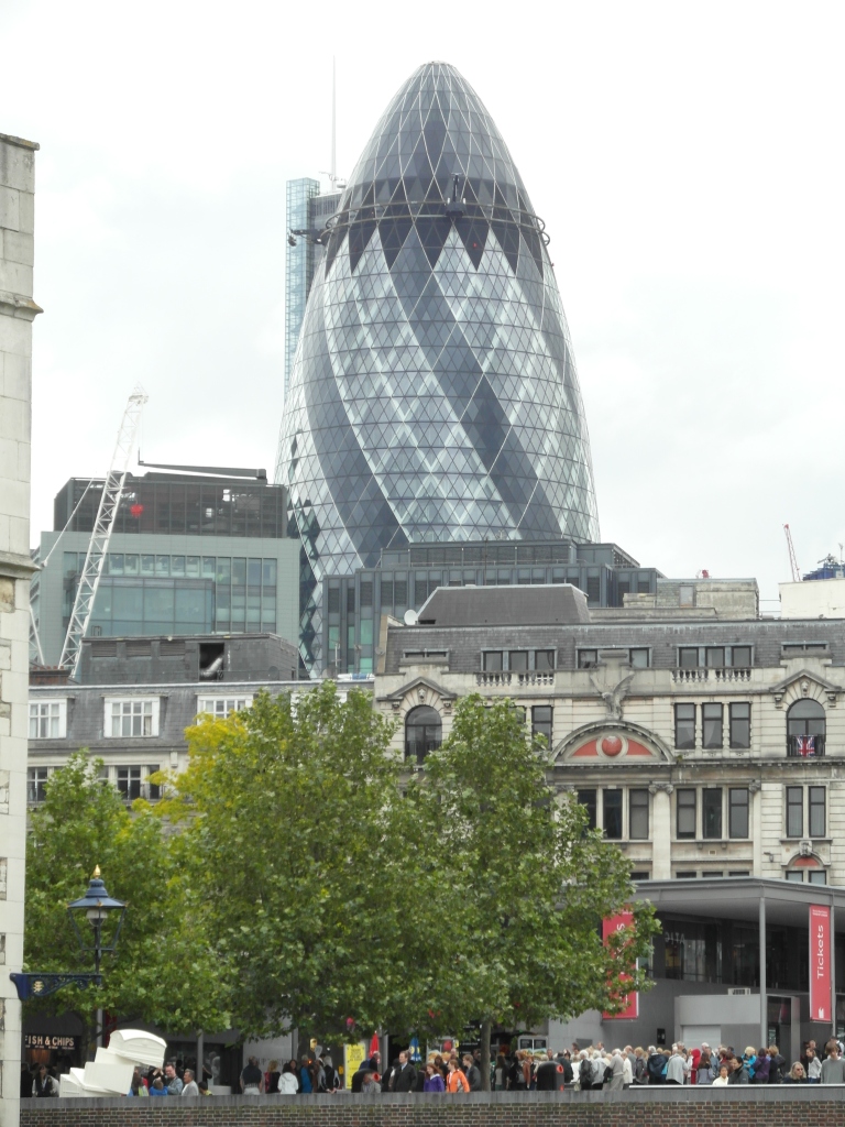
I took a lot of photographs whilst I was in London so that I could have a lot of source to refer back to and of course to remind me of the wonderful holiday! I focused on a lot of the more modern buildings and the buildings that are pretty well-known for their unusual shape for example, The Gherkin Building and The Shard.
The Gherkin Building
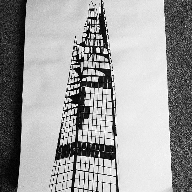
The Shard
I have been doing a lot of line drawings at the moment, some being of a graphic style and very sketchy!
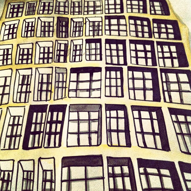
Fine Line drawing of The Shard. I was trying to show the shadows that I could see from all of the windows (and it’s practically all windows so it was a lot!) not entirely finished yet because I am unsure about it but I shall see…what do you think?
I have started look at a few buildings from my London Photographs so far…yet to start the Glasgow ones so i’ll need to get a move on me thinks! This is another building that I have been looking at:
I am not sure what this building is but it looks like a big modern office building! that looks pretty cool.
Watercolour with fine liner. Again, I was looking at the highlights and shadows that I saw in the windows and like the Shard….this building is covered in windows!
This buildings was outside the Tate Modern…which I love! I had been to the Tate before but had never notice this very vibrant building so it was a very nice surprise!
For my drawing, I stuck with the bright yellow as it was very unique to the building itself.
The style for these drawings are pretty bold and graphic, which is my style I guess! and I love it!
Well, I haven’t a lot of drawings at the moment, currently making a collage piece of the Gherkin Building and focusing on the shapes and windows. Will update you all soon of more drawings to come!
Bye for now!
Beautiful birds and more…Project 3 so far!
Border Crossings, Photography, Sketchbook Work, TextilesOver last semester and this semester, I have been working on a brief based on my identity/ culture. For my brief, I had to split my project into three parts:
- Project 1 – My Identity/Culture
- Project 2 – Developing from project 1 and then create a collection in my chosen specialism…which is print!
- Project 3 – Taking parts from my first and second project and creating paper samples/drawings that represent the Slovenian culture.

This is an examples of two of their coins showing each side.
As well as just drawing currency, I am very interested in drawing the animals and those that are particularly common in Slovenia. As a part of this project, I had to speak to students from Slovenia via email, Facebook, the university’s social network site set up for this project which is called “NING”. I have found Facebook particularly useful! One of the students recently sent me a message telling me about some of the coins and the animals, the coins with the birds in particular:
- 20 Stotins – Long – Eared Owl

- 2 Tolars – Barn Swallow

- 20 Tolars – White Stork
![]()
I think this could be quite an interesting approach to part of this project so I’m exciting to get cracking with it! When I was speaking to a Slovenian student, she said that the White Storks are on the coins and that Black Storks are quite common in Slovenia.
![]()
When I first seen these photographs,the very first thing my eye was drawn to was the bright red beak and legs! Against their black and white feathers, their legs and beak are really vibrant and eye-catching. When thinking about my colour palette for this project, I will definitely look at the animals for inspiration as of their vivid and interesting colours.
One of the Slovenian students told me some very interesting information about the Barn Swallow as it is a very common bird over there. She said that when she grew up (not in the city) that the older people said that when you see this bird coming back from a warmer country or part of that country, that spring has arrived. Also, they said that if a swallow is flying near ground, it is a sign of bad weather to come. I really liked the symbolism and the stories associated! The swallow is a very symbolic bird and has a lot of different meanings depending on the type or how they are seen. For example, swallows are tattooed quite a lot and thus they have various meanings depend on how they are drawn. Swallows are known as an old sailor’s tattoo and they were tattooed if the sailor had sailed over a great amount of miles. The swallow always returns home to their countries so a swallow tattoo symbolises the return home of a sailor and that they will always return home! Also, when Swallows are drawn in flight, it symbolises freedom. A very very symbolic animal!
I love swallows! the more reason to draw them as a part of my project.I also really want a tattoo and have been thinking of a swallow so maybe after this project, I might have a good idea of what kind of design I would like…who knows though!

One of the Slovenian students also told me that years and years ago, the people of Slovenia were very attached to nature and animals and so that is why there is a lot of stories and legends about the more common animals in Slovenia.
I am very interested in the bird approach because I really liked the colours and patterns. Even though there is a lot of common animals, I think the stories about the birds…the Barn Swallow, The Long Eared Owl etc are very interesting and would be exciting to look into! The Olm is another common animal in Slovenia and is very unique because it has only even been found in Slovenia. It is quite an odd-looking animal and there have been stories and legends that it is associated with dragons and dragons are a symbol of Ljubljana, Slovenia.

Quite an unusual looking animal! The colours are very complimentary and are really beautiful.
So…That has been some part of my research so far! I have started project three and have been looking at currency at the moment so here is a few photographs of some of my work so far!
Here is a slide show of all my photographs and a few close-ups.
A peek in my sketchbook!
Art, Border Crossings, Photography, Sketchbook Work, Sketching/Drawing, Textilesit’s been a while since I last showed some of my current project work so I believe it’s time for an update! From before, I showed some work from the first section of my project and that was drawings/paintings etc of different things that are associated with my identity and being indecisive. I had been drawing objects that mean a lot to me and thing’s that I can’t decide whether to throw away or even put away somewhere..they mean to much to me so wouldn’t want to hide them! For example, I have drawn an award from my HND in Fashion Textiles given to me by the rest of my class! so it was a very meaningful and fun award as everyone got a little hand-made textile related award.
Here is a photo of this award. I think it’s really interesting and cute! and sums me up and this theme for my project VERY well.
I recently found something else that also means a lot to me and it’s something I would never ever throw away. To make more sense of it, I have to say that I am a big fan of music, both listening and playing! I have played the trumpet since I was in 2nd at secondary school and before I decided to study Textiles, I had thought about studying music! I playing in a couple of orchestras and various bands as well. Was great fun! sadly, I do not have a lot of time to play anymore due to my course studies…sadface. Although, I have thought about bringing my trumpet up for the new semester and join the music groups in my University! So…to get to my first point again, the object that means a lot to me that I had recently found was a tuning fork. Something very random indeed but it was given to me by someone very special who is sadly not here anymore. My Grandad. So I will always treasure this object as it reminds me of a lot of wonderful memories.
This is the tuning fork!
 it’s quite a simple object but is quite meaningful to me as it reminds me of the musical memories and of course, the person who gave it to me.
So for the next section of my project, I had to develop my drawings and create some design ideas for screen printing. This part of the project had focused on the ideas of stacks of collections as I think it links with my first theme based on my collection of objects. I looked at objects such as magazines that I have collected but do not want to throw away even if I have read them already. It is something a lot of magazine lovers do so it’s a very common collectible! would definitely love to get a magazine subscription at some point. Anyway, I had also looked at the idea of Hoarding as I found out that one of the traits of hoarding is indecisiveness!…potential hoarder maybe?
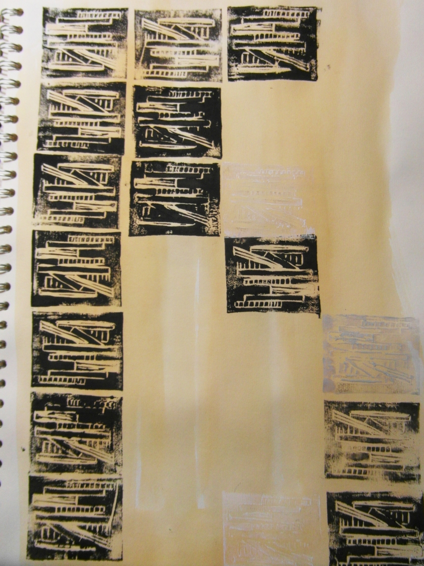
One of the stacked items that I looked at that I personally don’t collect myself, was stacks of newspapers or bound newspapers. Reason being, I found a few images online that I really liked as I found them very interesting and they appealed to my style of work. I feel that my work has a much more graphic style so the mono-chromatic colour scheme appealed to me! However, for this project, I wanted to introduce some colours so I had introduced highlights of a pastel pink and turquoise. I used these highlight colours in my prints as well as well as the blacks, grey and areas of white. However, I feel it has been a bit of trial and error as I feel they have not worked as well as I would have hoped. Therefore, I think I am going to mix up a new set of colours and use some of the colours that fit in a lot better with the mono-chromatic colour scheme and work on some linen fabric as oppose to silk. Reason being, I found the silk hard to work on as the printing dye bled a lot within this fabric!….So, I am definitely going to work on something a bit more sturdy!
Here is some photographs of some current sketchbook work relating to this side of the project!
The above drawing was a development idea from stacks of collected magazines. I really like this drawing because of the interesting placement of collage and use of small highlighted colours. When I was thinking about re-doing my colour palette, I was thinking about either taking a small highlighted colour from one or two of my drawings so perhaps the above mixed media piece or this mixed media piece:
I think that some of these colours from either of the two photographs above will compliment my mono-chromatic colour theme. I definitely want to continue on with my greys, smoky whites and blacks!…My neutrals colours I think and then add a hint of a much more complimentary colour.
Have a look at some of my other photographs of current work! There is also a few of my sample prints as well but they are not finalised.
Hoped you enjoyed this very long post! I do go on a lot sometimes..
Bye!
Project work so far!
Art, Border Crossings, Sketchbook Work, Sketching/Drawing, TextilesHello again! so my project for this semester is based on Identity and Culture and for this project, DJCAD is linked with two other art schools, one of which is in Texas and another in Slovenia. It has been a really interesting project so far and I am really enjoying exploring my theme for my sketchbook work!
My project is based on how indecisive I am ( a miracle that I actually decided to do this theme!) I have been looking at different objects such as: Things that I have collected and gifts that I have kept from over the years ( Jewellery, magazines, books, perfume bottles, dream catchers etc…). I have also been looking at things that help make people make decisions such as: Coins, dice?, magic 8 ball etc. Currently looking for more decision maker objects to draw so if anyone has any ideas that would be great!.
As my sketchbook has progressed, I have started to look at stacks of things that people collect such as: newspapers, magazines, dvds, cds etc. I don’t collect newspapers but I have been drawing a few and I really like some of the drawings that I have came up with. I am currently drawing some stacks of my magazine collections and working with different media’s. I have also worked out a nice colour palette ( well, I like it!) a few pastel colours and some greys/blacks/whites that are taken from the newspapers.
I have been considering a few different ideas that I could possibly progress onto with my theme. I firstly thought of hoarding because I found out that a key trait of a hoarder is someone that is very indecisive! (like myself) and someone who is a bit of a perfectionist as they always worry that something may not be up to a certain standard. A hoarder is basically someone who accumulates objects that they think they will need in the future. I also considered looking at being superstitious and the objects associated with that as I have a few dream catchers. Finally…I have considered looking at objects that help people make decisions and then lead on to the hoarding idea.
So…that’s a bit of my project so far! take a little look at some of the photos 🙂
Bye!
Indecisive. A part of my identity?
Sketchbook Work, Sketching/Drawing, TextilesIn my last post, I described some of my current project so far so thought I would show you all some of the current drawings that I have been working on in my sketchbook!
There is a range of objects from things that help make decisions to objects that I have kept because I couldn’t decide whether to put them away…Things that are gifts, random little objects, jewellery etc. I do however, keep objects that have been given to me because I do love everything gift I have been given as they each have different memories attached. However, I am still such a bad decision maker it’s unreal! Guess that’s part of what makes me who I am!
So here is some of my current sketchbook work.
Hope you liked my sketchbook so far! More very soon!
Another peek in the sketchbook!
Material Matters, Sketchbook WorkSo…recently I have been looking at rock formations and thinking about how I could get interesting patterns and more design ideas. Fingal’s Cave has been quite an interesting rock formation for me and it was this particular rock formation that inspired me for my pattern developments!
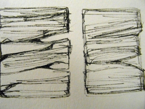
This is the sketch that I started my developments from!
For my development drawings, I have looked at two columns on the left so as not to over complicate my design. This is some of the styles that I have come up with!
I added in blocks of black so as to emphasise the shapes of the rocks in the column. Also, I feel that it makes the design more eye-catching and more interesting. To me, I think it has a sort of Aztec style to it…what do you think?
For these designs, I have used black fine line pen…my comfort zone! As I tend to work more graphic, it just seems to fit in well with my styles. As well as black, I wanted to add a hint of colour so decided to make it bright and use the orange and a turquoise blue that is featured in previous pages of my sketchbook. I am happy with the results of my development drawings so far!
To continue with my previous collage pieces, I felt it was only right to include little odd bits of collage. As well as this design pattern, I looked at different ways of creating another interesting pattern… Well I think they are interesting! although, I am very critical of myself so there is a part of me that knows I could experiment more!…but who knew a little tiny section of a drawing could spark so many creative ideas!
These are another set of development drawings from the same section of the very first drawing in the post! These designs are quite sketchy but I find them quite interesting and eye-catching. Still in the same media used from the others except this time, I used a light blue pro marker to emphasise the small accents of colour.
This is a selection of drawings and development ideas from my sketchbook. This slide show features some of the drawings above but includes more interpretations of similar designs. Hope you liked my design attempts so far! any ideas or anything that could help…let me know!





![IMG_1603[1]](https://lauraspeirs.files.wordpress.com/2013/02/img_16031.jpg?w=840&h=840)
![IMG_1606[1]](https://lauraspeirs.files.wordpress.com/2013/02/img_16061.jpg?w=765&h=1024)
![IMG_1602[1]](https://lauraspeirs.files.wordpress.com/2013/02/img_16021.jpg?w=765&h=1024)





![IMG_0249[1]](https://lauraspeirs.files.wordpress.com/2012/08/img_02491.jpg?w=840&h=840)

![IMG_0246[1]](https://lauraspeirs.files.wordpress.com/2012/08/img_02461.jpg?w=840&h=840)


