BINGO! Assignment 3C: Observe and Record.

21st Century Design, Assignment 3

So for the 2nd part of my “21st Century Designer” module assignment, I had to team up with a few people and people watch in one of the following places:

  • The Bingo
  • Football Match
  • Casino

I decided to go to the Bingo hall in Dundee with Errin Miller and Amy Malcolmson! Neither of us had ever been before so no one knew what to expect (unless of course, family members who go to bingo told us!). We were to go based on an place that we would never normally visit as opposed to a place we always tend to visit. So, we picked the Bingo!

Firstly, to get into the Bingo, we had to become members and pay £4.90 for 7 books and an extra Easter bonus game (this was for the second half as we arrived during the first game).I found that the staff were particularly helpful and explained everything that we had signed up for and made the membership quick and easy! We got allocated our welcome pack and free dab pen in any colour that we wanted too! A member of staff explained the rules of the game as we obviously didn’t look like frequent bingo game players! The concept of the game seemed fairly easy but the staff were at hand if there was any problems. Having helpful staff made the environment much more friendly so I think it would make the players feel happy and welcome. Especially newcomers.

So…as we had an assignment to do, I tried to get as much information I could before and in between games as Bingo is quite a fast paced game! Before the game started, I decided to put my people watching skills to the test and began to observe my surroundings. There was still a game going on when we sat down so this gave me a chance to see the bingo players in action! this is what I observed:

Players

  • Probably one of the first things I noticed about the players was that they were all very focused and very quick! whereas, I found it quite intense! I would have probably got a headache if I had been there a while!.Suggested that a lot of the regulars are very keen players and found it particularly easy to concentrate without getting distracted. They could be avid readers? or dedicated to certain hobbies such as knitting/cross stitch? something that requires a lot of concentration.
  • I noticed that a few of the players had electronic game cards as opposed to paper ones. This suggested to me that they were frequent players. They may have been computer literate? so they may be used to using computers everyday or every other day.It suggested they were fast learners and opted for a more modern approach so were keen to try to experience new things.
  • That a lot of people sat by themselves or in small groups. Also, they seemed to sit a part from one another even though the bingo hall is very big and has many seats and tables. Each area was also coloured coded (Red,Blue and Green) so it would make it easier for the staff to find the winners.
  • There was a lot of older people there but it was surprising to see another group of younger adults and a few other younger couples!
  • We had also noticed that the staff had glanced over to our table a few times whilst the games were on. Most likely because they could tell who the newcomers were! We were also quick to realise who the regulars where as they were very quick and were frequent winners. This felt quite intimidating I thought.
  

Decoration

  • Highly patterned and a lot of bright colours on walls, carpets, furniture etc. This suggests a fun and welcoming environment that would make you want to stay and play more games! As well as the bright interiors, the game packets, tokens and dab pens were also brightly coloured! This emphasise a much more enjoyable atmosphere.
  • When walking through to the large bingo hall, we entered a room filled with brightly coloured flashing slot machines and change machines! It felt like being at the carnival or in an amusement area with all of those bright lights! This could have been a plan when planning out this building? ways to encourage more money spending and gambling.

Advertisements

  • On most of the tables and the reception/help desks, there was a few leaflets on different offers held throughout the week for example, Monday was “Play for a Tenner” and Friday Mornings was “£1 for the Friday”. The colours used for those leaflets were also quite contrasting so It encourages more players as the deals are temptingly cheap!
  • We noticed that the food and drink was also at cheap prices so I think this tries to encourage players to stay longer and spend more on games.
  •  I noticed from a flyer that Mecca Bingo has online game playing so this suggested that the Bingo could be branching out to a wider age range and are also trying to encourage players to become much more comfortable with electronic equipment.

Atmosphere 

  • During game play, it is very quiet so there was no talking, only the sound of the bingo dab pens on the paper game cards. I noticed that this could be part of a “rule” .The only other noises are those of the bingo caller and anyone who shouts “House!” (which was a lot!). I noticed that whenever someone had shouted house or held their game cards up when a member of staff went over to check, other players would whisper to each other or would have sighed or “tutted”. This suggests that some of the regular players could have been impatient or even jealous as they did not win, perhaps a sore loser or easily angered?
  • There was a few slot machines in the main bingo hall but they were only played in-between game play. This seemed like another “rule”. They were quite loud machines so it would only be polite to play when a game is not on. I witnessed this during on one of the breaks.

After all of the games, we all discussed our observations and how we thought we coped with the speed of this game. We were not the only students there so we got a chance to discuss what we observed with two other 2nd year textile students. Dione Bowlt and Eilidh Alexander. When we all discussed, we found that our results were pretty much the same! Fast, intense but oddly addictive! Dione and Eilidh also spotted the much more experienced players in the hall right away whilst they were playing.They had arrived an hour before us so they had got really into it by the time we had arrived for the 2nd half! Overall, I think that we had all really enjoyed the experience and agreed it was very addictive!

When I was thinking about things that related in previous workshops or lectures, I had thought about our Subcultures and style tribes workshop and the brief lecture as I had missed the main lecture due to being in beautiful Paris with a few other textile design students! When I thought about subcultures and the bingo, I tried to think of it as in how the bingo attract their players and is it with their offers? I noticed it’s mainly an older audience, about 60 upwards. However, the brightly coloured interiors and flashing lights suggest a younger audience and more fun environment, not an older and more calming environment. I think this is because they want the players to stay as long as possible! keeping the interiors bright and fun makes the environment much more exciting and relaxing I feel because if it was dull and grey, the atmosphere would quickly deteriorate. It could also be a way of trying to attract a wider player range and not just the usual age groups. When thinking about style tribes, I found this one quite unusual as the bright colours and flashing lights do not necessarily attract the older generation, more so the younger generation so what attracts the older generation? could be that it was something very popular years and years ago and they had been brought up with it.

During some breaks between game play, I put my observation skills that I learned from “Snoop” by Sam Gosling, to the test! Snoop taught me to look between the lines and look for things that are not as obvious, things that could tell you something brief about a complete stranger. Encourage you to ask questions like Why did she sit there? Do they come here often and if so, is it daily? As I was facing the back wall ( I know, not the greatest place to sit!) I noticed an older woman at the very back. She was by herself and seemed a little angered when other’s called “House!” so this suggests she could be impatient or easily angered? Also, could suggest that she likes to be on the go and constantly having something to do. It was clear she was a regular because she was very fast, had her own dab pen and from what I presume, had a few different bingo game books (she wasn’t as close to see how many she had) so this could suggest she is a fast learner and can easily multi-task. When I decided to observe much more closely, I started to gain much more information.The objects and her behaviour whilst playing this game helped give me a brief insight into what I think could be part of her personality. Her impression on me was that she was a regular due to her speed. I noticed something quite strange whilst in the Bingo but then it came clear that it could have been quite common, who knows! Anyway, there was a couple who were sitting just a few tables away from us and when they left, that same woman who I had seen up the back, moved down to the recently emptied table for the next game. Odd?…perhaps but I thought that maybe that was her regular table so that was another point that made me think she was a regular player. This gave me another insight to her personality, maybe she was a very fussy person and who liked things done in a certain way? neat, organised and likes to stick to a routine or schedule.

When I imagined the bingo, I imagined it to be quite slow and maybe a bit boring?…oh, I was very wrong, it’s fast and quite addictive once I got into it. It was an interesting experience!

Overall, I found this assignment oddly exciting! I think it was great trying something completely new and in an environment that I am not entirely used to. When I first started playing the game, I found that it was quite intense and really fast paced but when I play a few games, I got quite into it! Once I figured out and remembered things about the bingo that my Gran had told me such as, the numbers being in a particular order, particular place etc it became quite addictive! If it hadn’t been for this assignment, I probably wouldn’t have stepped foot into a bingo for a long time so this experience was quite fun!

Assignment 3A: Service Design Tools

21st Century Design, Assignment 3

Last year, I studied a module in University called “Change By Design”. In this module, I learned a lot of interesting and very useful information about design and information like how to design for a purpose as well as a particular person or client.There was a particular topic that came up during last year and it was based on Service design. Service design is about planning and organising people, communication and the materials of a service in order to improve the quality and communication/interaction between clients or customers.

For one of the lectures last year, we had a guest speaker who discussed her company and what service design is all about. Lauren Currie, our guest speaker, is the director of her own service design company called Snook. She focuses on changing the lives of people in Scotland with service design and practical actions. Her lecture was very interesting! there was a lot of different information about service design and it was something that I had never knew about before.

For one of our very first assignments last year, I was put into a mixed group of different second year design students. This gave us the opportunity to get to know different students from a different design specialism and experience different ideas and views from another students perspective. So for that first assignment, we had to brainstorm and then create a mind-map based on “The Tipping Point” by Malcolm Gladwell. We had also been assigned to read The Mind Map book so it would teach us how to mind map properly and more effectively. Also, when Lauren Currie held some workshops, she taught as effective ways to brainstorm and mind map.  From doing this assignment, I feel much more confident with mind-maps and I think that since then, I have learned to use them a lot more within my projects.

Mind Mapping is a service design tool and it has been one that I have come to use a lot since my “Change By Design” module!

At the start of each new project, I start my first page in my sketchbook as a mind – map. Reason being, I feel that after my previous workshops in last years module, the skills I have learned have really helped me with my work. When doing my mind-maps, I always create them the way that I had in my previous module. This has helped me remember a lot more information about any theme or project work because of the effective layout of my mind maps. For example, it is essential to use different branches that show the different points that have to be remembered and it is best to colour code them so they are easier to remember! Also, it is also suggested to include small diagrams as this helps makes things easier to remember. Good excuse to get creative! Also, the mind map is always there to refer back to if needed.

Here is an example of a few mind maps done in my “Change By Design Module”. I really liked creating these mind maps and I have found them useful in my sketchbooks. Not just for me but I think that by having them there, it makes it easier for the viewer to understand parts of the project illustrated in the sketchbook.

There are many different Service Design tools such as:

  • Mind Mapping
  • Mood Board
  • Affinity Diagram
  • Story Boards
  • Task Analysis Grid

and many more…

Throughout my studies, I have only used the mind-mapping tool as it has been the most effective and perhaps easiest way to approach any new projects or tasks. Even in school, mind maps proved useful (even though they may not have been done correctly!). When I was looking through a website based on Service Design, I looked at a lot of the different service design tools and related case studies for more inspiration and ideas on how to approach new tasks, projects etc.

A Service design tool that I came across that I would like to explain is the Mood Board. A mood board is basically a visual composition of photographs, pictures, drawings or ideas. When together, it is easier to see all of your ideas and thoughts on a current task as they are arranged neatly in front of you. I have never used a lot of mood boards in any of my current projects but from reading about this tool, I think they would be highly beneficial. If I were to use it in my current project at the moment or projects to come I think that I would first start out by creating a mind map and then once I have my key ideas that I really like from my mind map, I would create a mood board based on those ideas. I think that this would help me visualise what would be best to do for my project as I think it would give me a much clearer idea of my current theme. Also, I think that by doing this, it could also spark off other ideas. I think it would be important to have your mood board looking very neat and precise as I think it is key that it must have a good composition so you can clearly outline your main ideas.

This is an example of an effective mood board.

Nikki McWilliams.

21st Century Design, Art, Textiles

Yesterday, in my 21st Century Designer module, I was lucky enough to hear a talk from Nikki McWilliams!

Nikki graduated from Duncan of Jordanstone College of Art and Design (DJCAD), the University of Dundee. She studied fine art but also took a screen printing course at Dundee Contemporary Arts Centre after she graduated because she had always wanted to screen print and sadly missed the opportunity whilst in University. After she graduated, she first started to make badges with various different designs for family and friends but then realised that they became quite popular so she decided to sell them online. She then moved on from badges and started creating her own fantastic cushion collection!

Here is some of her badges and brooch designs!

She uses her screen printing talents to hand print each and every cushion! I think this is really personal and makes the product even more brilliant I think because it shows that she cares for each and every product she designs and sells! Her collections are inspired by British Culture and Pop-Art.

Here is a few of her great designs!

How great are these!? I especially love the Bourbon… best.biscuit.EVER!

I find these cushions really interesting and very cute! the detailing and colours are so perfect and simple and would easily make any interior very eye-catching!

All of her fantastic products are online at www.nikkimcwilliams.com so have a little look! well worth it!.

Nikki has also attended a big trade fair in London called Top Drawer. She was in a section called “Spotted”. After the trade fair, she was then contacted by Selfridges in London. Massive fashion department store in London (if you have never heard of it!). So later in the year, her collection of fantastic cushions will be on sale in Selfridges, London.

If your a keen blogger or slightly addicted…like myself! Have a look at her own blog! – www.nikkimcwilliams.blogspot.com

So check out her website and fantastic collection of art,prints and beautiful cushion designs!

Byee!

People Watching…in the Zoo!

21st Century Design, Assignment 3, Photography

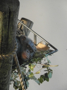
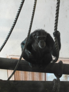
Last Thursday for my 21st Century Design Module, I was on a class trip to Edinburgh Zoo. I had never been before so I was really excited for it! As it was a class trip, I had to go there not only to see the many animals but to observe and take a note of the different types of people and their reactions whilst in the zoo. This was quite a fun experiment because it was interesting to see how different people/age groups etc reacted to the animals and the zoo as a whole.

For this trip, I decided to go in a team with Amy Malcolmson and Errin Miller. As the zoo was very big, it was easier to do it in a smaller group!. Whilst walking around the different enclosures, we managed to take a lot of information down about different people’s reactions as the zoo was quite busy when we arrived!

When I was looking around, I was thinking about the sort of social behaviours that are normally associated with the zoo for example, the strict rules (for obvious reasons of course!) not to feed animals etc so this makes me think about how people feel more cautious around the larger animals, how different ages groups react for example, children seemed much more excited and more enthusiastic than their parents to see the animals however, their parents were happy that their children were enjoying themselves.

So when I was walking around looking at the animals and people watching, I noticed particular behaviours among different age groups, here’s what I observed:

  • Children – very excitable, eager to get to the front of the enclosures to see the animals, laughter, raised voices when talking about the animals to their parents,, brothers sisters etc, energetic as were moving around a lot/running.
  • Parents –  Protective of their children when they get close to the enclosures or when the animal came up close. Also, when they were walking about and making sure their children didn’t run off or hurt themselves. Parents didn’t seem as enthusiastic as their children but were happy to see their children happy. Some were telling their children about the animals, teaching them different exiting facts.
  • Adults – Some of the older adults were discussing the animals and maybe discussing interesting facts or reading the information signs. When I went to one of the monkey enclosures, an older couple were there discussing the monkey’s and laughing at the monkey’s playful behaviour…as was I!
  • Zoo Staff – very organised and focused on what they were doing, strict when some children/people got too close.
Here is some photographs from last Thursday!


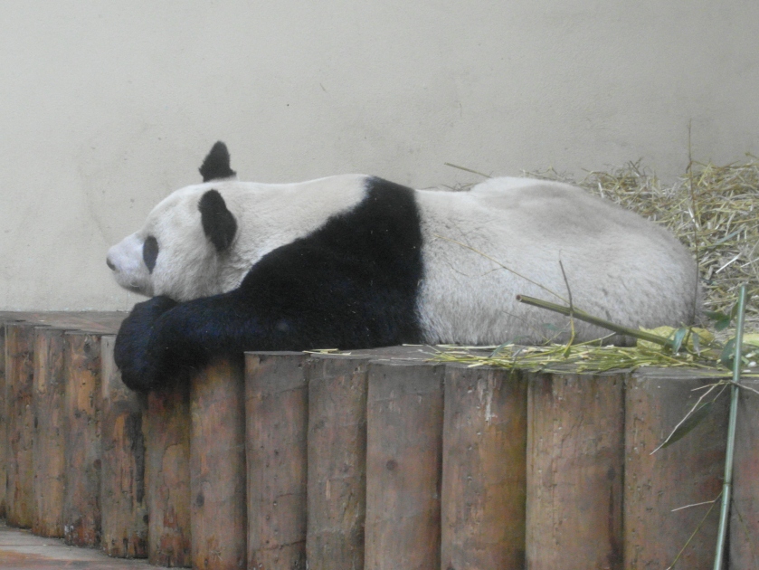
Whilst on this trip, as a group, we got the opportunity to visit the Panda’s! We were only able to see one of them as the other’s were not on show unfortunately. The Panda we got to see was Tian Tian.


Tian Tian is the female Panda and when her name is translated, it means “sweet” or when repeated in chinese, it puts emphasise on the word so it would be translated as “sweetie”. So Cute! The Panda’s haven’t been in the zoo for a year yet so the Zoo staff said that the Panda’s don’t fully settle until they have been there for a year. It was great to see the Panda’s having never seen one so close before! it was a great experience to see Tian Tian and what she is like in her enclosure. When we went inside to one of the large windows outside her enclosure, we learned all about her and other Panda’s and the many interesting facts! When we arrived for the tour, she was sleeping but we were told that Panda’s sleep most of the day so it wasn’t uncommon for her to be asleep. However, she did move around a few times into different sleeping positions! (so there was a lot of pointing and excitement when she did!)

Whilst in the enclosure, I began to observe again so I could get information about different people’s reactions. As it was mostly my class from our module, we were all roughly around the same age however, our lecturers and a couple of older students were also there.  Here is some of my observations:

  • Students ( roughly around the same age…18-22?) –  Taking lots of photographs so this to me, showed the excitement. Crowding round the large windows to get a good look at the Panda, talking to one another about Tian Tian, listening in to the information being told by the zoo staff.
  • Adults – discussing the Panda’s, taking photographs so it suggested they were still as excited to see Tian Tian! Listening to the zoo staff telling everyone the facts about Tian Tian.

After about 10 minutes or so, I noticed that the students that had been previously at the front, had moved to the back so as to let the other students have a look. Whilst they were at the back, I noticed that a few had their phone and were talking with friends so it kind of suggested that they may be discussing the Panda’s or had seen what they wanted to see already so may have been discussing other things.

To get more information on the different Panda’s, here is a link to the Edinburgh Zoo Website: PANDA’S!  I totally recommend the Zoo if you have never been! was lots of fun and is a great day out!

Overall, I found last Thursday really enjoyable! I learned quite a lot and I think I have become much more observant through this experience as this experiment has taught me to be more aware of my surroundings and not just a certain thing. Seeing all the animals was great as well!

Hope you enjoyed this post!

Assignment 2: What Images Mean

21st Century Design, Assignments

For Assignment 2: “What Images Mean” for our 21st Century Design module, we had been given the task to do an experiment that associated with three random images. Also, we had to go into our own teams so I teamed up with Amy Malcomson, Errin Miller and Morgan Daily. The images that we chose had to be random and they could not display any text. This is the three images we found:

All of these photographs were from the website “Stock.xchnge” and they were selected through the randomiser tool.

The images shown consist of a beach chair on a quiet beach, a woman on a bike in New York City and an old vintage clock. Each of these images are unrelated to each other so this helps our team to understand the meaning of semiotics ( symbols,signs, images that can mean more than one thing). Also, this assignment also gave us the opportunity to experiment to test the concept of Polysemy.

For this assignment, as a team, we had to ask the public about each photograph and what information they could get from it. We then had to ask them to suggest a story that links all three images. For this particular assignment, we could not ask art and design students but instead ask a range of other students, general public, staff etc. Here is some of our answers!

Person 1: Male, 20, Student at Abertay University studying Sports and Exercise.                                                                                                                              

  • Photo of the chair on beach: Seems like a chair that an elderly couple would sit on, quite relaxing.
  • Photo of girl on bike: In New York, warm, very busy day
  • Photo of clock: Beat up old clock that doesn’t work anymore.

Person 2: Male, 21, Student at Abertay University

  • Photo of chair on the beach: Looks quite lonely as the beach is empty/quiet, very hot.
  • Photo of girl on bike: Very hectic and busy, quite frustrating.
  • Photo of clock: Vintage, it’s broken and worn and the clock face is broken. Symbolises death.

Story connecting the three photos: The beach represents childhood, a place to have fun and relax. Then the next photo represented late teens – early 40s, a place where they have to work, it’s frustrating and everything is very rushed. The last photo represented the elderly, retirement and the broken glass suggested that it could symbolise the wrinkles or lines.

Person 3: Female, 20, Neuroscience student.

  • Photo of girl on bike: yellow taxi – well-known in New York. single girl on bike, contrast of busy car build up behind – picture for the environment? Also the calmness of the girl on the bike – very relaxed looking (no blurring of pedals – easy rider) again contrasting the business of the car build up behind. The obvious red lights everywhere – possible symbolism again, contrasting the easy riding being performed by the girl on the bike.
  • Photo of Clock: the face of the clock appears to have fallen to appear upside down contrasting the frame of the clock, possible symbolism to “change in time” ? The clock appears to be vintage (roman numerals rarely seen on modern clocks), along with the rusting copper – possibly a symbol, again, of changing time? The clock has a “brand” (Thomas) again a symbolism of its past. past – present – future?
  • Photo of sun lounger – lounger background – the beach. very natural scene. this contrasts the plastic bright yellow, man-made sun lounger.

Story connecting three photos – The future for our planet is bleak. Pollution from landfills, rubbish-burning and automobiles will soon fill our atmosphere, where clean, fresh air once was. Rising tides, as a result of that pollution, will soon see the end of relaxing sea-side holidays. It is time for change

Person 4: Female, 18, 1st year Geography student. 

  • Photo of girl on bike: new york, saving the environment by using a bike, hot day
  • Photo of clock: old, antique, broken & squint.
  • Photo of beach chair: bright, made for two people, relaxing on beach, hot day.

Story connecting three photos: A woman who likes to relax on the beach to pass time but likes to stay fit so she doesn’t age prematurely.

Person 5: Female, 48, accountant 

  • Photo of girl on bike: Looks like America, New York, Girl out shopping on her bike with basket, sunny hot day – shadows cast.
  • Photo of Clock: Looks like it has been salvaged from an old burnt down house or found at the bottom of the sea.
  • Photo of Beach chair: Thinks it could be some sort of beauty stall when you go to the beach to sit and get your toe nails painted.

Story connecting three photos: Girl is on a cruise ship holiday, stopped off at New York so she hired a bike to explore, then went to the beach to get her toes painted all in time for being back on the boat at 12

Person 6:Female, 18, Dance Student

  • Photo of girl on bike: America, Yellow cabs, L.A. Hot sunny, people have their legs out, busy, people crossing the roads.
  • Photo of Clock: Clock, old-fashioned, squint and broken.
  • Photo of Beach Chair: Beach, sun chair with shade and bits for legs, different looking, maybe for 2 people to share.

Story connecting three photos: Hot day in L.A, riding a bike to the beach and on the way finds the clock washed up on the sand

Person 7:Female, Bio medical Science student, 19

  • Photo of Beach Chair – relaxation at the beach, Blackpool vibe, looks like an advertisement for a holiday
  • Photo of Clock – old, time, broken, vintage
  • Photo of City – metropolis lifestyle, girl is main focus, busy, hectic

Story connect three photos: take time to relax and enjoy the simple pleasures in life

Person 8:Female, Psychology, 19

  • Photo of beach chair – relaxed, feet up, Thomas cook, holiday
  • Photo of Clock– age rusty,fading of beauty
  • Photo of City – annoying cyclists, slow, frustration

Story connecting three photos: Shes running out of time to cycle to her holiday destination.

photographed by Errin Miller

I found this assignment quite interesting as I thought it was really great to find out what different people thought and what information they got from just briefly scanning the photos. Also, I thought it was really interesting to hear what story they got from these photos even though they had only seen the photos for about 5 minutes! This part of the assignment helped me understand the concept of Polysemy ( Idea that images can mean more than one thing) This is true I think  because an image can mean something very different to what someone else thinks of the same image.

For the next part of the assignment, we had to choose a story from one of the participants we asked earlier on, this then became our target story. We decided to choose the story from person 3 as we thought that it provided the most potential and information.  As a team, we had to choose another photo that would connect/relate to our target story and then ask a new set of people about the four photos and what story they get from them. The purpose of this image was to relate to our story and so we could get similar answers/stories. The images didn’t have to be in any precise order as we had to let the participant put them in their own order so they could tell the story that they get from the photographs.

Our target story was from a  Neuroscience student at The University of Dundee.  Her story was very detailed and her views were quite interesting too! She discussed pollution and how we as a planet, are running out of time to change things. This is a true story I think and it is one that has been in the media a lot so we thought that by carefully adding a selected image , it would help spark the stories about the environment, global warming and pollution into the minds of our next participants. Ideas that would relate to our target story.

This was our final photograph linking to our target story.

As a team, we all discussed that this photograph was best because we felt it highlighted global warming and pollution very well. It suggested different ideas to each of us such as: Polar bears (extinction), Melting Ice Caps, Temperature rising etc. Also, it conveys how little time we have to fix these problems and that we are running out of time. Moreover, we thought this fitted in extremely well with our target story and we thought that it would help give a much more clear idea of the story linking all four photographs.

For this part of the assignment, we had to ask a set of different people but only ask what story they got from looking at all four photographs. Here is our results!

Person 1. Male, Library staff, 26.

  • A time travelling polar bear that would have to go to the beach to prevent ruining the city.
 Person 2.Female, History student, 21.
  • People vary in where and what kind of holiday they want depending on their age.
 Person 3.Male, Sport & Exercise student, 23.
  • Polar bears are being sent to zoos so they are out of their natural habitat, which shortens their lifetime.
 Person 4.Female, Cafe worker, 30.
  • Global warming not long left for it to be fixed, we need to be eco-friendly. Time is running out.
From this experiment, the fourth image wasn’t as obvious in our experiment. Some people’s stories were pretty much accurate with our target story but other stories were quite varied. So, after that, we decided to add some words under the photos in order to help people to guess our target story much more clearly. We added the word “Pollution” to our city image and the words “Soaring Temperatures” to our beach chair image. This really helped with our experiment when we asked a new set of people!
Photographed by Errin Miller.
These were our buzz words!
Here is our results from the next set of people we asked:
Person 1.Female, Zoology  Student, 19.

  • Global warming has had a big impact on nature, Time is running out and we are ruining some animals environments/homes.
Person 2.Female, Hairdresser, 23.
  • “Poor polar bears”. Their homes are being taken away from them through global warming (melting ice caps etc), pollution from cities is ruining the environment.
 Person 3.Male, Architect , 20.
  • We have to be more eco-friendly just like the woman riding the bike in the city photograph. Climate change is happening and something has to be done.

From conducting this experiment , it is clear that it all worked and people had a general story about the environment, global warming etc when they looked at the photographs with our added words (Finally!). When looking back at the four photos without the words, it wasn’t very obvious that it was something about the environment as most of the photos looked like holiday destinations and not environmental problems! Overall, I found this assignment quite enjoyable! I found it very interesting to hear the many different ideas and stories that different people got from each of the photographs. I feel that it really opened my eyes to how people can view things very different and can even spot things that may not be clear on the first viewing of a photograph etc. Also, really helps me understand all the different ideas in the book “Snoop” by Sam Gosling.

For part of this assignment, we had to read the chapter “The Rhetoric of the Image” by Roland Barthes. I have to say, it wasn’t the easiest read in the world but I think I managed to understand the ideas being put across in this chapter. In this chapter, Barthes discusses that there is three messages that are conveyed in the advertisement he was analysing.

Photograph from 21st Century Design Module blog.

The first of three messages conveyed was the text (text at the bottom corner of the advertisement), the symbolic message ( The food, Italian themed…) and the non-symbolic message (the pasta and sauce). It suggested to me that just from thinking about these three messages, it shows that there is a lot of different meanings portrayed in one simple photograph or advertisement. For an advertisement, this is a very beneficial factor I think as it would get the customer to think about what an advert is trying to sell, not only the product but the experience conveyed. So for this image, it suggested to me that the company is obviously selling the product but they are also trying to sell the experience if you buy this product. For example, they may want you to think that by buying this product, it will be very similar to Italian dining and their traditional cuisine.

So, in the context of this assignment, I think that this chapter has helped gain more understanding about the concept of Polysemy. Furthermore, it has helped give me a better understanding of the different meanings that the selection of people we asked for this assignment came up with when they looked at our four photos. Each meaning and story varied from person to person so I found it very interesting when  we conducted this experiment. When different people analysed some of the photographs, some looked beyond the obvious and tried to think about a deeper meaning to the image. They didn’t just point out the clock (Photo of the clock) but they pointed out that it had a vintage feeling, broken, conveyed a feeling of death and suggested a later part of life such as, the elderly, retirement etc. So, from reading this chapter by Bathes, I feel I understand the concept of Polysemy a little better than before. However, I did find this read quite hard to understand at times. However, it is interesting.

Here is a photo of the little leaflet we handed out to each of the people who kindly answered all of our questions!

Photographed by Errin Miller.

We thought that this would be a nice way to thank all of our participants and let them see what the results were for this assignment. So a big thank you to all of our participants and I hope you each like our posts containing the results!

21st Century Designer: What Images Mean.

21st Century Design

On Thursday for my 21st Century Design module, we had a workshop in which we had 10 images that we had to analyse with our teams (Team 2). The intention was to look beyond the obvious (what the image shows, black and white etc )and figure out the purpose of each of the images. I found this workshop very interesting and fun! I think that it made me look at photographs differently because from reading ‘Snoop’ it has taught me to examine photographs in much more detail and look beyond the obvious features.

For each of the photographs, we were asked to consider the setting, colours, clothing, expressions and props portrayed. After an hour of analysing, we discussed as a class of what conclusions we had all come to for each photograph. All the images we were given were adverts for different things, some were much more straight forward than others and a few were quite hard to work out so there was some surprises and a few laughs!

I learned a lot from this workshop! I learned that an advert doesn’t just sell or focus on their products but they also try to portray and sell a different lifestyle. For example, when we analysed a photograph for a Coca Cola advert, it showed a very happy family at a bowling alley having fun. Therefore, it suggested to me that it promoted a fun, energetic and a family orientated lifestyle as well as selling the product.

This was one of the photographs that we had to analyse and had chosen for our next task. As a team, we came up with several ideas:

  • Vintage photo – possibly from the 1950-60s
  • In a bowling alley
  • Noticed that the girl on the left was holding red cups.
  • Warm colours were used (reds, yellow, oranges…) conveyed a happy environment.
  • We thought that it was a family environment so suggested that the advert could have been something to do with that.
  • Promoting the ‘American Dream’.

This is the classic photograph that we had chose to use for our next photo analysing task. As a team, we had already analysed it so for this task, we had to ask 4 other students (excluding art students) about what they thought of the photograph and what they got from it. We didn’t mention that it was an advert until the very end. We had to see if they could guess themselves!

So this is what they got!

Person 1: It was a girl who studied IMD.

She thought that it looked happy, was in a bowling alley as she noticed they all had matching t-shirts. That it looked like it had been taken in the 1960s. She noticed that the girl on the left was holding something and guessed it was some sort of coffee advertisement or it advertised the bowling alley. She said it showed a family and fun environment.

Person 2: Male American exchange student studying Physics, English and Chemistry.

He thought that it showed a really fun environment as he commented on the excitement that each member of the family had on their faces. He also thought it also may have been a campaign for propaganda. he thought that it looked staged and fake, this was quite interesting because it hadn’t been mentioned in the workshop from any of the teams! Also, the propaganda campaign thought was quite interesting as well. He noticed that it may have been in the 1950s.

Person 3: Female American Exchange student studying Forensics.

This student was with the previous student so they shared a lot of the same ideas and she thought it had elements of being a propaganda campaign. She also thought it was set around the 1950s and could have also been advertising a bowling alley.

Person 4: Male member of staff from the ISE Gym.

This person gave the most information about the photograph. He noticed that the girl on the left was holding red cups so thought it was some sort of refreshment advert. He mentioned that the photograph was quite blurry so suggested it could have been an older advert. He guessed it was taken or set around the 1950s. He said a lot that the family looked very happy and enthusiastic especially, the boy who jumped in the air! He said that it conveyed a mood of happiness. He was pretty dead on about the photograph and when we told him that it was for Coca Cola, he was only bit surprised as he had guessed it was a refreshments advert.

This was a really fun workshop and I feel that I have learned a lot! It is quite surprising to what I learned from just observing a photograph much more closely. I think if I had looked at it quite briefly, I would have never have guessed it was for an advert! So this experience was quite enjoyable!